Your CV Looks Like a Mess
And That’s Why You’re Not Getting Interviews
Your CV has one job: get you an interview. But if your layout is one of the bad ones—messy, overdesigned, or hard to scan—it could be killing your chances of getting to the next stage. Let’s look at the worst offenders, the better options, and the one layout that actually works.
You’ve worked your socks off to get through a pesky ATS, and your CV finally lands on the desk of a real human.
But if it looks like a design student’s final exam, no one’s reading it.
You’re going straight in the bin.
Let’s fix that.
Your CV has one job: get you an interview. That’s it. Not to show off your Canva skills. Not to express your personality through colour gradients. Just to get a human to say, “Yeah, let’s talk to this person.”
And visual impact and layout play a massive part in that.
Here’s a breakdown of three real CV formats — based solely on how they look at first glance:
• One that screams “NOPE”
• One that’s trying (but still not helping)
• One that actually works
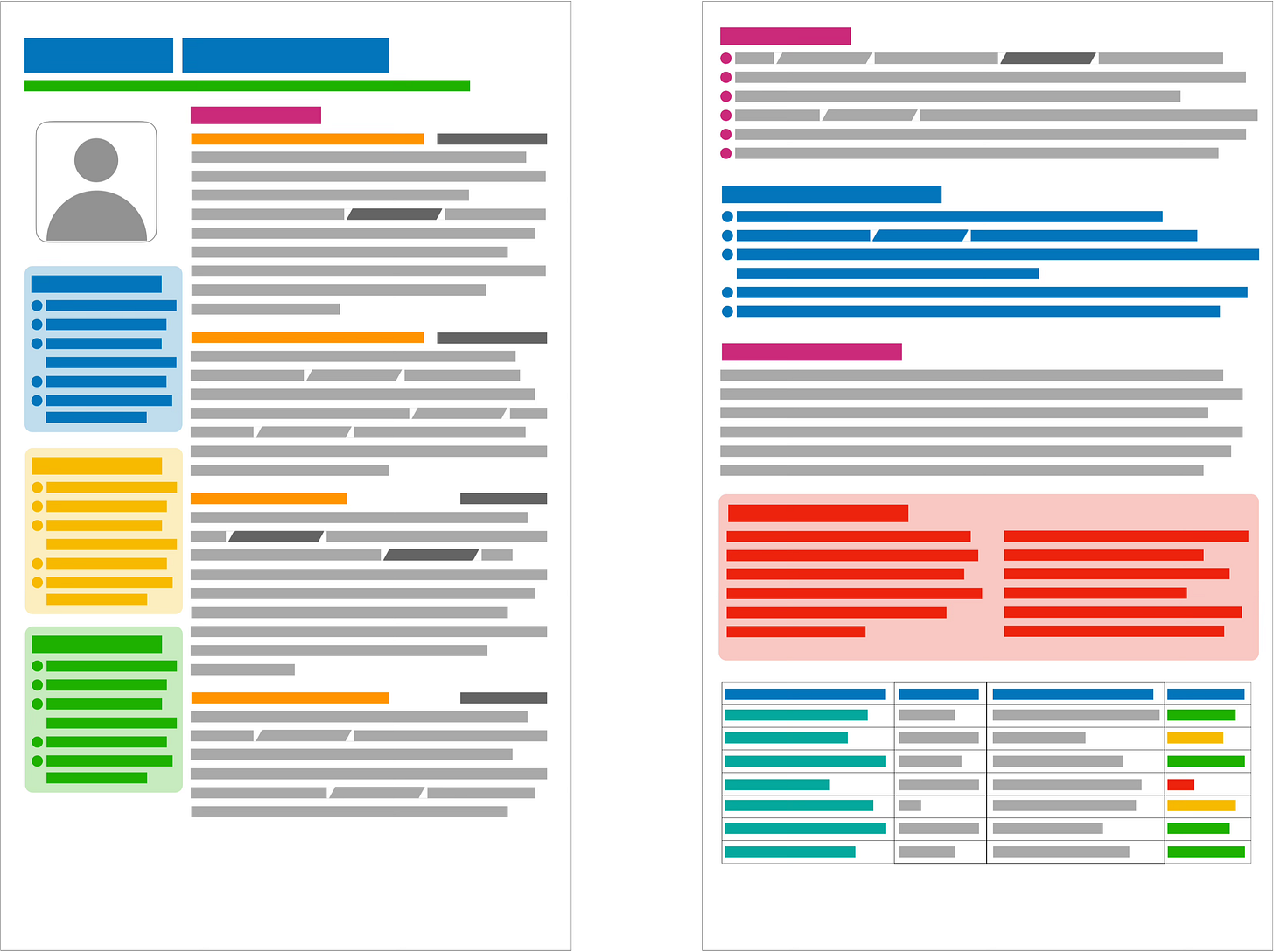
🟥 The really bad one
At first glance, you might think: “That looks good!”
And that’s the first warning sign.
Your CV isn’t supposed to look good. It’s supposed to be easy.
Easy to scan. Easy to find the important stuff. Easy to say yes to.
This version is packed with colour. Split into two columns. Overloaded with icons.
And for some reason it has a profile photo.
So yes, it looks like effort. But it’s the wrong kind of effort.
Why it fails:
No visual hierarchy. Everything is fighting for attention, so your eye doesn’t know where to start.
Everything is bold, italicised, boxed, or shaded, so nothing stands out.
The photo wastes space and introduces bias.
Tables and columns confuse ATS systems.
This isn’t a CV. It’s a brochure. And a messy one at that.
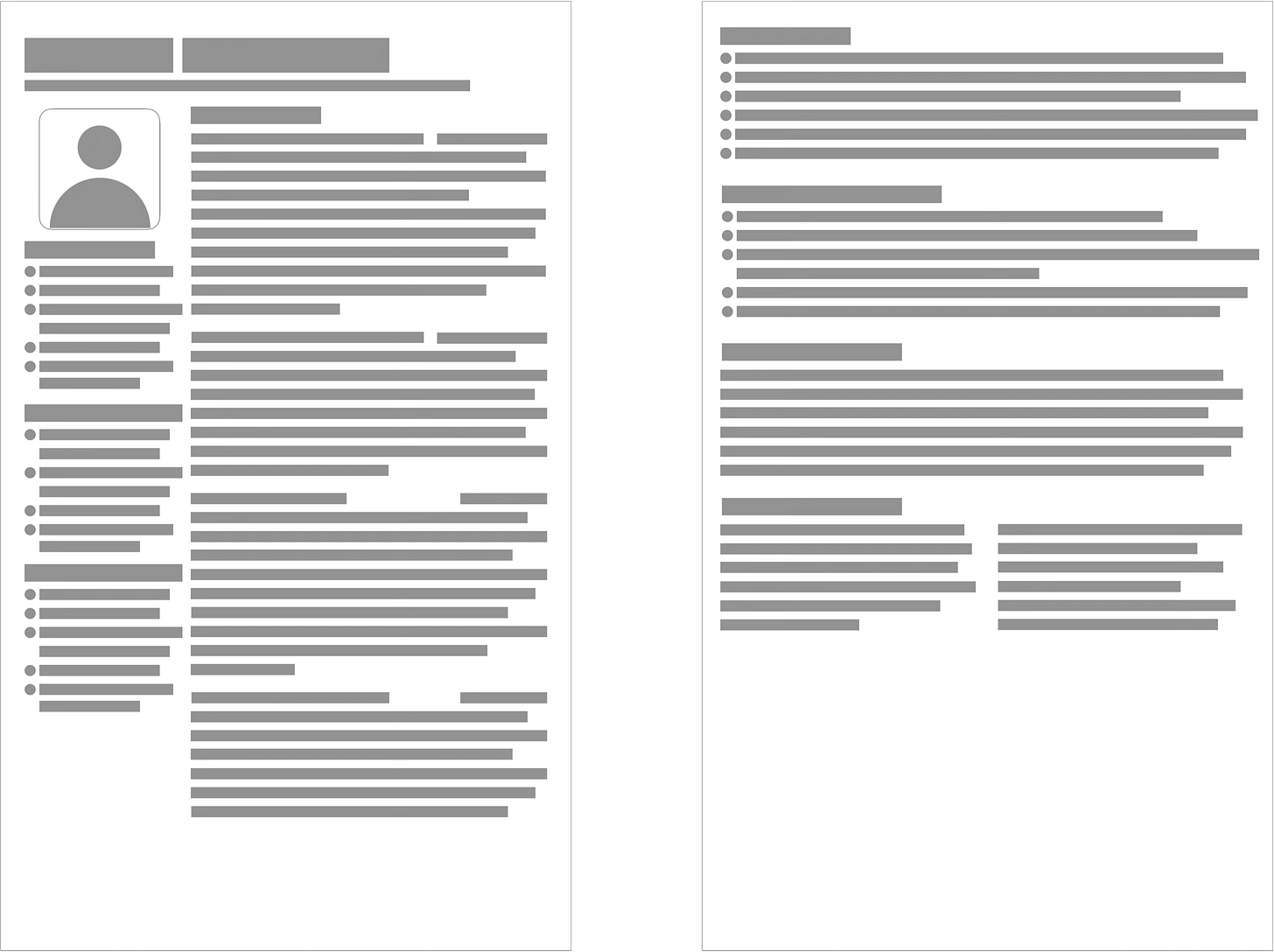
🟧 A slightly better one
This one’s taken a step in the right direction.
It’s ditched the colours. The table has gone. The formatting is calmer. And there’s an attempt at structure.
But…
It’s still in two columns.
The photo’s still there.
It lacks clear hierarchy
Why it fails:
The layout isn’t scannable. It’s a visual maze.
The headshot doesn’t help. It just takes up space.
This one’s trying. But it’s still shouting “This is going to be a messy interview.”
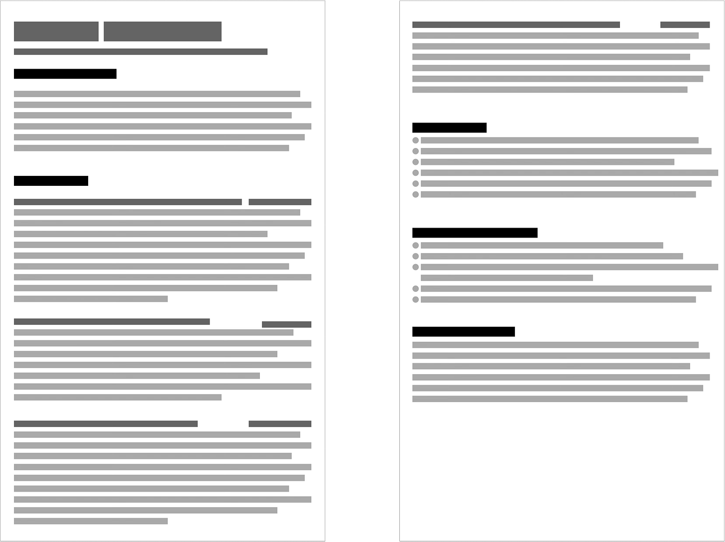
✅ The good one
Finally, one that works.
It’s clean. One column. Strong headings. Clear bullet points.
There’s more white space. It’s dissappointingly bland, but that’s a good thing.
No photo. No icons. No nonsense.
Even without reading the content, you can scan this and instantly spot the name, contact details, professional summary, work experience, dates, companies, and additional sections like skills or achievements.
What it says about you:
“I know how to communicate clearly. I’m concise, organised, and thinking about the reader — not myself.”
Why it works:
Built for clarity.
Structured and spacious.
The layout guides the eye naturally.
Works for both humans and machines.
Sharp, confident, and professional.
Which is exactly the impression you want to leave.
You have removed roadblocks and made it easier for the reader to place you in the ‘interview’ pile.
Let’s talk about profile pictures
Including a profile photo on your CV is a bad idea. Full stop.
It introduces bias before your skills even get a look-in. Whether conscious or not, hiring managers bring assumptions, and a photo gives them something to judge that has nothing to do with your ability.
It also wastes space that could be used to showcase what matters: your experience, results, and value.
In many countries (UK, US, Australia), photos are discouraged or frowned upon.
So leave it for LinkedIn. Keep your CV clean, professional, and distraction-free.
But what about ATS systems?
Glad you asked.
ATS (Applicant Tracking Systems) aren’t impressed by fancy formatting.
They don’t care if your CV looks amazing. They just want to extract text cleanly.
A simple layout helps because it avoids:
Tables and columns that break parsing
Icons and images that get ignored
Header and footer text that never gets read
One clean column = maximum readability.
That’s true for ATS, and even more true for the person reading your CV afterwards.
What should you do?
You’ve seen what doesn’t work. You’ve seen what does. Now here’s how to format your CV the right way.
Here’s your checklist:
Ditch the photo.
Use a single column.
Create clear headings with breathing room:
Heading
Subheading
Subsubheading
Be consistent:
Use the same format for all headings of the same level (think h1, h2, h3)
Use a single font for the headings (ideally a sans-serif font) and a single font for everything else.
Serif fonts (like this one on Substack) are often easier to read in longer blocks.
Avoid tables.
Use bullet points for achievements (not duties).
Keep formatting simple.
No colour explosions.
No icons, no boxes, no sidebars.
And one last tip
Show your CV to someone outside your industry.
If they say “Wow, that looks great” before reading anything—change it.
The point is to get read. Not admired.


